FryBabies
An identity and app experience for betta fish breeders that blends science and play.
An identity and app experience for betta fish breeders that blends science and play.
Intro
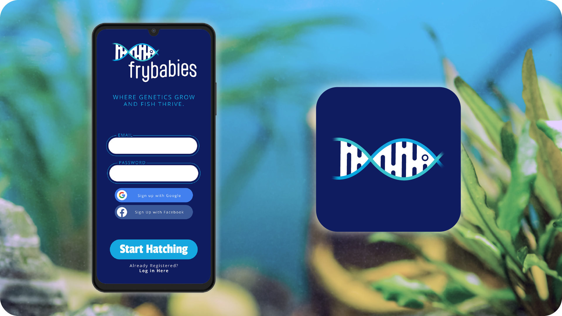
FryBabies helps Betta splendens breeders track pairs, traits, and lineage. I delivered strategic brand identity, logo design, app UI and package design so the product feels approachable for beginners and trusted by experts.
FryBabies helps Betta splendens breeders track pairs, traits, and lineage. I delivered strategic brand identity, logo design, app UI and package design so the product feels approachable for beginners and trusted by experts.
Role
Creative Director and Designer
Scope
Strategic brand identity, logo design, app design, package design
Creative Director and Designer
Scope
Strategic brand identity, logo design, app design, package design
Outcomes
• Friendly, modern identity that signals genetics and craft in one look.
• Streamlined flows that make goal setting and inventory tracking simple.
• Packaging that pops on shelf while reinforcing the brand’s tone.
• Friendly, modern identity that signals genetics and craft in one look.
• Streamlined flows that make goal setting and inventory tracking simple.
• Packaging that pops on shelf while reinforcing the brand’s tone.
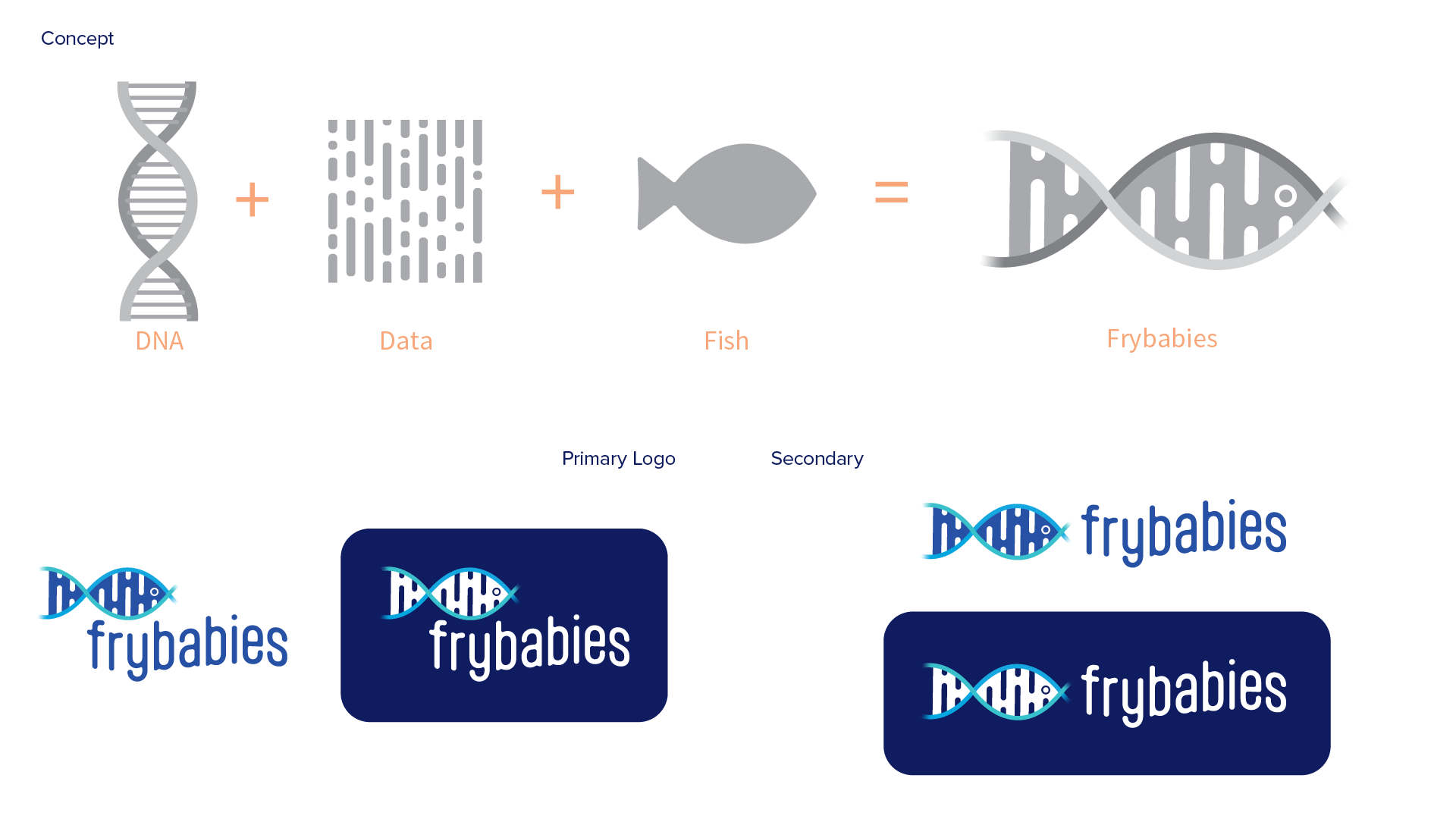
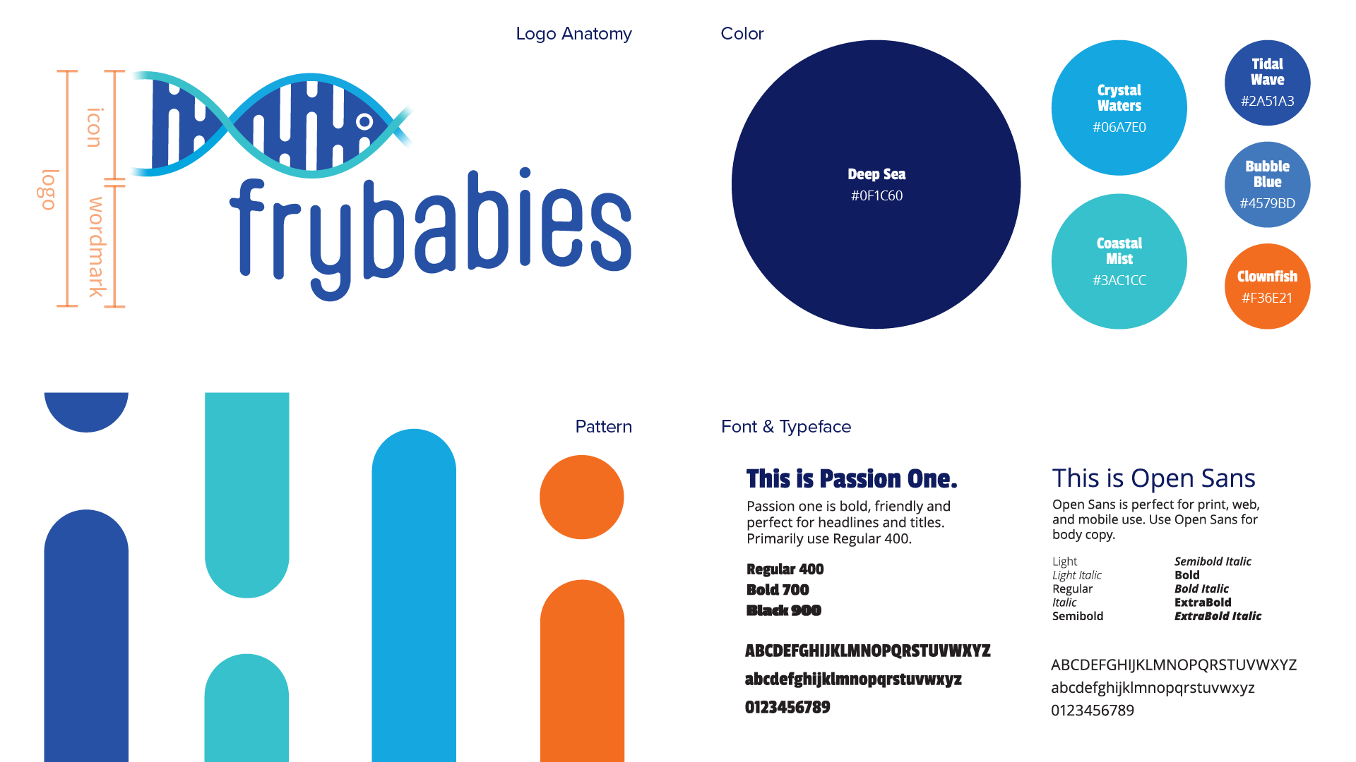
Visual Identity
Logo concept merges DNA, data, and fish to reflect breeding and lineage. A deep aquatic palette with bright accents keeps the system clear and welcoming. Typography stays friendly and modern to support an easy interface.
Logo concept merges DNA, data, and fish to reflect breeding and lineage. A deep aquatic palette with bright accents keeps the system clear and welcoming. Typography stays friendly and modern to support an easy interface.
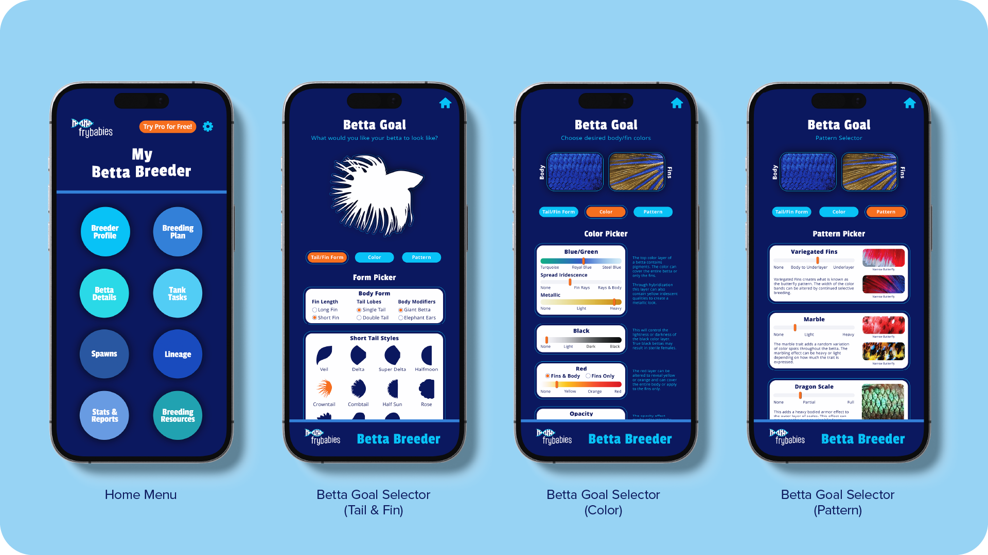
App design
UI focuses on clarity and guidance so breeders can move from goals to records without friction.
UI focuses on clarity and guidance so breeders can move from goals to records without friction.
Betta Goal Selector
Clean categories for tail and fin form, color, and pattern guide users step by step to define outcomes. Interactions are simple and visually led.
Clean categories for tail and fin form, color, and pattern guide users step by step to define outcomes. Interactions are simple and visually led.
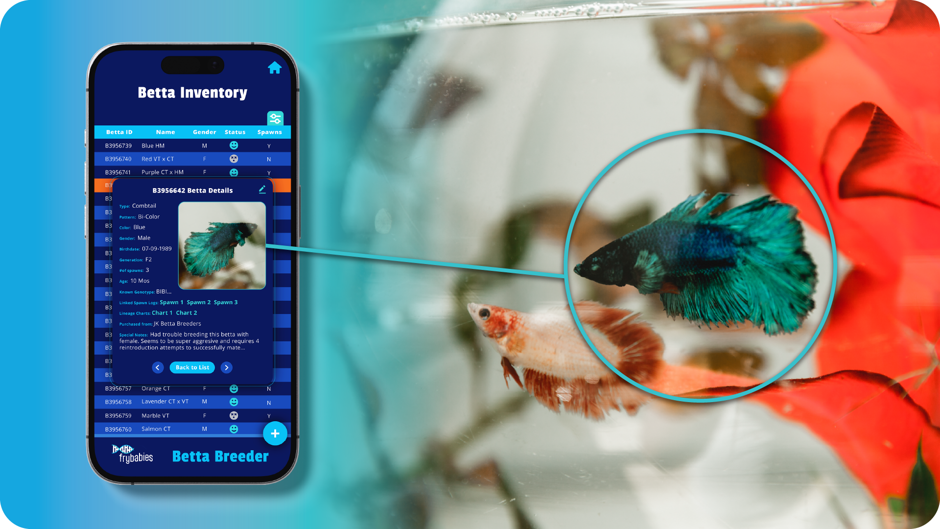
Betta Inventory
Track species, color, lineage, and breeding history with image galleries for quick reference. Layouts make updates and organization effortless.
Track species, color, lineage, and breeding history with image galleries for quick reference. Layouts make updates and organization effortless.
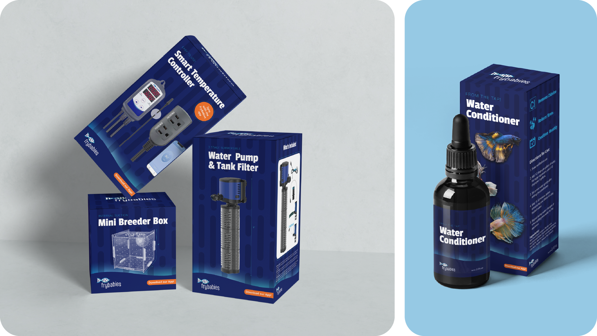
Packaging design
Bold color and clear type create standout labels that feel playful and professional. Information is easy to scan and consistent with the digital experience.
Bold color and clear type create standout labels that feel playful and professional. Information is easy to scan and consistent with the digital experience.

Process
Challenge
Breeders needed a friendly way to set goals and track lineage.
Approach
Interviewed hobbyists, mapped flows for goals and inventory, designed a bright identity and UI that reduces steps and clarifies choices.
Result
An approachable brand and app that turns complex tracking into simple, guided tasks.
Credit
Confluence Media Group team critique
Confluence Media Group team critique

Like this project?