Radiance Aluminum Fence
Modernized identity and sales collateral for a premium aluminum fence brand.
Modernized identity and sales collateral for a premium aluminum fence brand.
Intro
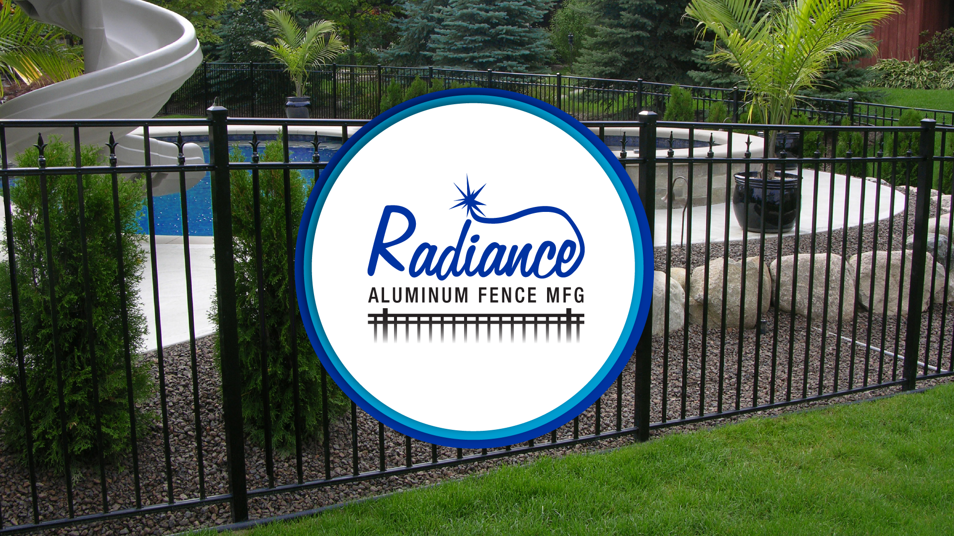
Radiance Aluminum Fence delivers durable, high quality systems with standout details like the Radiance Revolutionary Rail. I refreshed the logo and designed literature that highlights strength, beauty, and clear product choice while keeping the brand consistent across print and digital.
Radiance Aluminum Fence delivers durable, high quality systems with standout details like the Radiance Revolutionary Rail. I refreshed the logo and designed literature that highlights strength, beauty, and clear product choice while keeping the brand consistent across print and digital.
Role
Creative Director and Designer
Scope
Logo refresh, brochure, sales sheets, literature design.
Creative Director and Designer
Scope
Logo refresh, brochure, sales sheets, literature design.
Outcomes
• Simplified mark with better legibility and versatility across mediums.
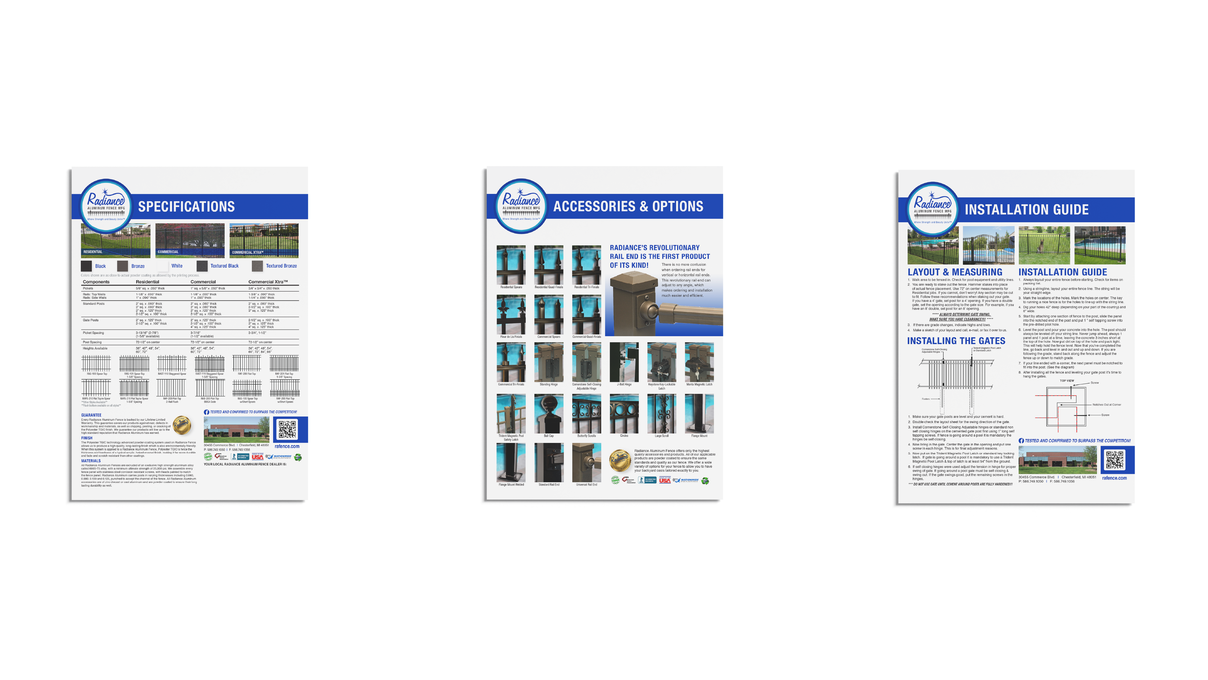
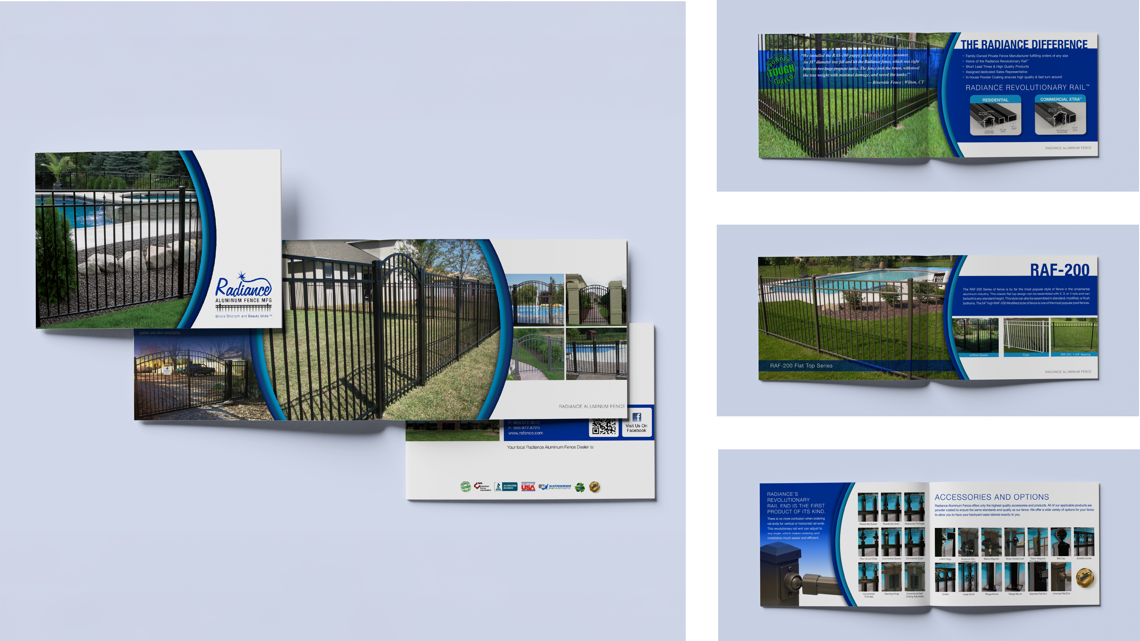
• Cohesive brochure and sales sheets that make options and specs easy to compare.
• Consistent visuals that align product beauty with brand strength.
• Simplified mark with better legibility and versatility across mediums.
• Cohesive brochure and sales sheets that make options and specs easy to compare.
• Consistent visuals that align product beauty with brand strength.
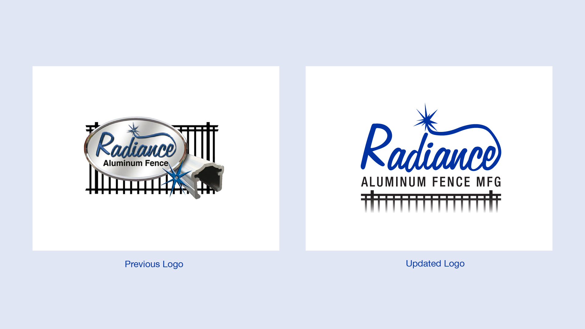
Logo Refresh
The previous mark was detailed and tough to apply. I streamlined the icon and updated the typography for a cleaner, more adaptable logo that preserves Radiance’s sense of strength and elegance across print and digital use.
The previous mark was detailed and tough to apply. I streamlined the icon and updated the typography for a cleaner, more adaptable logo that preserves Radiance’s sense of strength and elegance across print and digital use.
Literature
A focused brochure and a set of sales sheets present systems side by side with clear hierarchy, spec callouts, and application imagery. The layouts use a consistent grid and generous spacing so reps can walk customers through choices quickly and confidently.
A focused brochure and a set of sales sheets present systems side by side with clear hierarchy, spec callouts, and application imagery. The layouts use a consistent grid and generous spacing so reps can walk customers through choices quickly and confidently.

Process
Challenge
A detailed logo and scattered literature made the brand hard to apply.
Approach
Simplified the mark, reset type and layout rules, and rebuilt brochure and sales sheets with clear comparison and spec callouts.
Result
Cleaner identity and literature that help reps explain options quickly.
Challenge
A detailed logo and scattered literature made the brand hard to apply.
Approach
Simplified the mark, reset type and layout rules, and rebuilt brochure and sales sheets with clear comparison and spec callouts.
Result
Cleaner identity and literature that help reps explain options quickly.
Credit
Solo project with peer critique
Solo project with peer critique

Like this Project?